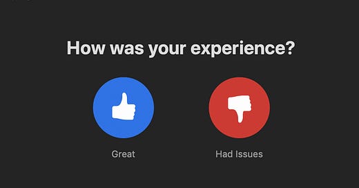
Data cannot be divorced from the context in which it is collected. For example, Zoom has over 300 million daily meeting participants. At the end of every meeting they're greeted with this:

Click on the blue button and you can carry on with your day, probably another Zoom meeting. Great.
Click on the red button and you’ll see this:

More thought and more effort are required. Not so great.
There are times when blue pill or red pill decisions are consequential. This isn’t one of them. As James Clear notes in Atomic Habits:
“Energy is precious, and the brain is wired to conserve it whenever possible. It is human nature to follow the Law of Least Effort, which states that when deciding between two similar options, people naturally gravitate toward the option that requires the least amount of work.”
Here the path of least resistance flows through the blue button:

While I’ve had many less-than-great Zoom experiences, you wouldn’t see it in my user data. I don’t think I'm alone here. A recent article in National Geographic on zoom fatigue details why virtual interactions are draining.
One reason is that while nonverbal cues are a big part of communication, this dynamic is absent in video chats. Is the person you’re talking to nervously tapping their leg? Are they even wearing pants? Who knows.
The format is also cumbersome:
“Gallery view—where all meeting participants appear Brady Bunch-style—challenges the brain’s central vision, forcing it to decode so many people at once that no one comes through meaningfully, not even the speaker...Think of how hard it would be to cook and read at the same time. That's the kind of multi-tasking your brain is trying, and often failing, to navigate in a group video chat.”
Not surprisingly, Google searches for zoom fatigue have skyrocketed:

Source: Google Trends, Zoom Fatigue Search Term, May 10, 2020
By inserting or removing friction, designers can tip the scales of behavior in one direction or the other. E-commerce companies like Amazon and Etsy devote considerable resources towards making it as easy as possible to add items to your shopping cart and to check out. The opposite is also true. Think of subscriptions where you can sign up quickly online, but need to make a call to cancel. Here added friction deters cancellation.
It’s not difficult to imagine a product analyst at Zoom feeling quite satisfied with the user feedback the product receives. But it’s also not hard to imagine that the Law of Least Effort introduces a bias towards the blue button. Reality is probably more purple.


